
QI tools and methodologies
Learn how to use the various tools and methodologies that you will be shown how to use for your project intervention. On this page are examples of tools from the NHS Education for Scotland Quality Improvement zone.
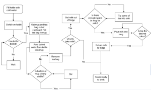
A process map is a planning and management tool that visually describes the flow of work. Using process mapping software, process maps show a series of events that produce an end result.
What is it?
A visual display that includes:
- Where a process starts and ends.
- The sequence of steps in between the start and end of the process in the order that they happen.
- Yes/no decision point in a process.
- Arrows that connect the steps and decision points in a process and show the sequence they happen in.
- Process maps can be used at different levels from a high level less detailed map to a more detailed process map that breaks down bigger steps into smaller chunks depending on the level of analysis required.
What does it look like?
Why use this tool?
- To capture and visually represent all the steps in an existing process.
- To show everyone in a team how a process works in practice now, rather than what they think is happening.
- To help identify change ideas for improvement.
- To visually represent a new process.
- To assist team building as it should involve all team members in accurately capturing current process and the design of any new process.
Where does this tool fit in the improvement journey?
- Understanding systems
- Developing aims
- Testing changes
- Leadership and teams
- Project management and communication
- Measurement
How to use it?
Process Mapping works best as a group exercise.
- In your teams agree the first and last steps in the process so everyone is clear what process they are working on. Conventionally first and last steps are represented in an oval shape.
- In your teams identify all the tasks and decision points in the process.
- Write them on post it notes and stick each task and decision point on a wall in the order it happens now; writing on post it notes allows the steps/decisions to be moved around if needed. Conventionally tasks are represented in a rectangle and decision points in a diamond shape
- All group members should review the process map to ensure it is correct and complete.
Process maps can be used at different levels from a high level less detailed map to a more detailed process map that breaks down bigger steps into smaller chunks depending on the level of analysis required.
Analyse the completed map taking account of value adding steps agreed by the team to identify any steps or decision points where improvements could be made. For example, steps where there is unnecessary work, duplication, bottlenecks, delays etc.
Use outputs from process mapping to aid system understanding to help develop your change.
Source
https://learn.nes.nhs.scot/2272/quality-improvement-zone/qi-tools/process-mapping
- Helps to identify a set of underlying causes of a problem.
- It is easy to learn and apply provides a visual way to share thinking.
- Can help to develop ideas to change the system?
What is it?
- By repeatedly ask ‘Why?’ (use five as a rule of thumb), you can peel away the layers of an issue, just like the layers of an onion, which can lead you to the different root causes of a problem.
- The reason for a problem can often lead into another question.
- Your team may need to ask the question fewer or more than five times before you get to the origin of a problem.
- The real key is to avoid assumptions and logic traps and encourage the team to keep drilling down to the real issues that underlie why different factors have aligned to contribute to something going wrong.
How does it work?
Use in a team and share it with others to start to identify possible changes to test.
- Write down the specific problem.
- Writing it down helps you formalise the problem and describe it accurately. It also helps to focus on the same problem.
- Use brainstorming to ask ‘Why?’ the problem occurs then, write the answer down first.
- If this answer doesn’t identify the source of the problem, ask ‘Why?’ again and write that answer down.
- Some of the Whys may be part of the same issue so think about how you might group these together.
- There will often be more than one cause, so repeat the process as many times as you need to. It can also be helpful to use this in conjunction with cause and effect analysis to help explore the different types of causes.
- Your team can then think about possible change ideas that will help with the identified causes.
What is it?
A visual display that includes:
The name of the problem stated a way that does not pre-judge its causes.
- Major cause areas/categories for the causes of the problem, for example materials, processes, people, environment and equipment.
- The reasons and root causes associated with each category/cause area
Possible solutions for each root cause. - A cause and effect diagram is sometimes called a fishbone diagram after its resemblance to the bones of a fish or an Ishikawa diagram after its creator.
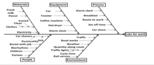
How to use it?
- In teams agree the precise problem to be solved based on data and team consensus.
- Give the problem a name that avoids pre-judging the cause(s).
- Write the name in the problem statement box on the right-hand side of the diagram.
- Go where the problem arises and gather facts, not opinions about the problem.
- Brainstorm the reasons.
- Write them individually on yellow post-its.
- From the post-its agree the major cause areas/categories the team should focus their thinking on.
- Write each of these at the end of a fishbone (e.g. people, materials, methods, machines).
- Place each of the yellow post-its to the left of the appropriate bone. Sometimes this will spark more discussion where further ideas are generated.
- For each effect on the post-its ask the “5 Whys?” and continue to do so to determine the true root cause of the problem. If there is disagreement about the root cause gather more facts.
- Use pink post-its to record the agreed root causes.
- Place them beside the relevant yellow post-its.
- Then use the “5 Hows?” to generate solution ideas for each root cause.
- Use individual green post-its to show each solution idea and place these to the right of the relevant fishbone.
- When complete take a photograph of the Fishbone and/or type it up to allow all team members to reflect on it for agreement.
- Use this to develop an improvement plan.
- Prioritisation of improvements based on ease of implementation and impact.
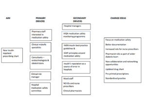
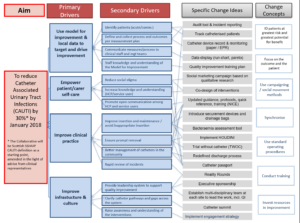
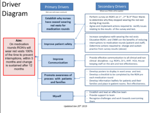
What is it?
A driver diagram is a visual display of a team’s theory of what “drives,” or contributes to, the achievement of a project aim. This clear picture of a team’s shared view is a useful tool for communicating to a range of stakeholders where a team is testing and working.
Why use a driver diagram?
To break any broad aim, graphically, into increasing levels of detailed actions that must or could be done to achieve the stated aim.
What do driver diagrams do?
- Encourages team to expand their thinking.
- Keeps thinking linked to the overall aim.
- Allows participants and reviewers to see the logical links and completeness at every level of the plan.
- Supports the development of measures.
What are the component parts?
Overall aim statement – a clear, action orientated statement of the improvement effort.
Primary drivers – system components that contribute directly to the chosen aim or goal. Processes, rules of conduct, structure to achieve the aim.
Secondary drivers – elements of the primary drivers and which can be used to create change projects. Components and activities.
Relationship arrows – show the connection between the primary and secondary drivers. A single secondary driver may impact upon a number of primary drivers.
Driver diagrams examples
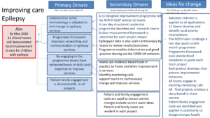
Example one
Example two
Example three
Example four
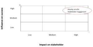
Stakeholder Analysis is a way of identifying, prioritising and understanding your stakeholders.
What is it?
A stakeholder analysis is an interest/influence grid with four quadrants. It enables you to plot or map stakeholders based on their level of interest (high/low) and level of influence (high/low). Where you plot a stakeholder guides the actions you should take for involving and communicating with them. The quadrants and how to manage them are:
Involve – high interest & high influence
Stakeholders in this quadrant will be actively involved in your project and be able to exert a significant influence on how it progresses. A lot of effort should be put in to making sure they are engaged. An example would be teams you are working with to develop and test changes.
Engage – high influence & low interest
These stakeholders will not want detailed communication, but because they can influence your project, enough work should be done to keep them satisfied. An example would be a senior sponsor who receives regular progress updates. Increasing their level of interest in the work could also be important for example if they can unlock resources or champion your work.
Keep engaged and involve where needed – high interest & low influence
Stakeholders in this quadrant will not be actively involved throughout your project but do want to hear about progress and may be able to provide input. They need to receive regular updates, but not so much they are overwhelmed or lose interest. An example would be teams who may be involved in the future but who are not yet actively involved who receive newsletters or social media updates. Service users may also be interested, and should be involved to make sure improvements are of benefit to them, so you may be working to increase their influence in the system.
Keep informed – low influence and low interest
These stakeholders will be part of your system and there may be the potential for your work to involve or concern them, so they should know what’s going on however do not bore them with excessive communication. An example could be other services whose work is linked to your improvement project but has no impact on them. If service users are in this category at the start you will likely need to make efforts to increase their interest and involve them in the work.
Stakeholder map example
Why use this tool?
- Identify who your stakeholders are; this is anyone who has interest in the improvement project or will be impacted by any changes.
- Use the opinions of your stakeholders to help define your improvement work at an early stage and gain their support.
- Guide the development of a communication plan for stakeholders to help them understand what the improvement work is about, to maintain and build further support for it where possible.
- Identify potential issues which could arise as the project develops, identifying ways to manage negative impacts.
Source: https://learn.nes.nhs.scot/27433
This communication and engagement strategy is designed to support the organisation to reach its objectives and vision. It sets out our approach to communication and engagement.
What is it?
A Communication and Engagement Plan is a written document that describes who you need to communicate your improvement work to, the purpose of communication with them, the communication method you will use, how often you will communicate and who will communicate with the audiences identified.
This is an example of a blank communication plan template which you can download from the resources below.
Why would you use this tool?
Planning a communication strategy at the very start of improvement work is a key part of the improvement journey that can be easily be overlooked. This tool provides a way to structure communication and engagement planning in order to:
- Generate interest, enthusiasm and support for the improvement work at the outset,
- Keep stakeholders informed, up to date and to sustain interest with progress of the improvement work,
- Inform stakeholders about the outcomes of the improvement work,
- Celebrate success,
- Generate interest in adapting the improvement work to spread to wider areas.
How is it used?
Communication Planning works best as a team exercise.
Top tips for communication planning:
- Identify the stakeholders i.e. the key people and groups who should be informed about the improvement work and the level of influence they have,
- Identify the purpose of the communication for each of the groups identified, for example to engage, sustain interest or share outcomes and celebrate success,
- Identify what will be communicated. Key features may include: Why this particular improvement work is important, changes, results, lessons learned and next steps,
- Identify the best method of communicating with each of the groups identified,
- Identify when each group will receive communication,
- Identify who in your team will carry out each piece of communication,
- Some organisations have communication teams and specific branding for the organisation. It would be useful to contact them to check at the start of your communication planning.
Source: https://learn.nes.nhs.scot/2844
What is it?
PDSA, or Plan-Do-Study-Act, is an iterative, four-stage problem-solving model used for improving a process or carrying out change.
PDSA is a very structured four-step cycle which requires effort and discipline
It incorporates careful and detailed consideration of the following:
- Plan: A plan of what is to be tested including questions to be answered, predictions and answers to the questions and a plan for collection of data to answer the questions
- Do: Carry out the test of change according to the plan, recording observations including unexpected outcomes/observations
- Study: A comparison of the data against the predictions made in the plan and study the results
- Act: Make a decision about the next course of action
Whilst the PDSA cycle originates from industry, it has been incorporated into the Model for Improvement. It can be used to test ideas in the real or simulated context
Why do we use the tool?
- To learn what happens when we try to do something differently
- Use the PDSA Cycle to build knowledge. Knowledge is gained through careful predictions about what will happen during testing and then comparing what actually happened.
Find out more about PDSA’s by visiting learn NES Scotland.
A Pareto Chart is a tool to help you understand your system.
A Pareto chart is a type of bar chart in which the factors that contribute to an overall effect are arranged in order from most frequent to least. This ordering helps identify the “vital few” — the factors that warrant the most attention.
It also includes a line showing the cumulative % (so you can see easily for example that the top 3 causes account for 80% of incidents).
According to the “Pareto Principle,” in any group of things that contribute to a common effect, relatively few account for the majority of the effect.
How to use it
You may have data already collected, e.g. from incident reporting, or you might have to gather data specifically. You will need to arrange your data in a table showing number in each category of interest.
Pareto charts work best if you have more than 30 observations across the categories graphed (although if you have a lot of categories you may need more data). Smaller numbers can be misleading due to random chance.
The classification by categories is only a guide to where to focus attention. It does not necessarily tell you that something individual to that category is the cause of the different frequencies seen.
It is useful to know if underlying processes are stable (only random variation) across the time frame for the data in the Pareto chart, in order to correctly interpret it. Pareto charts don’t explain what sort of variation is being observed.
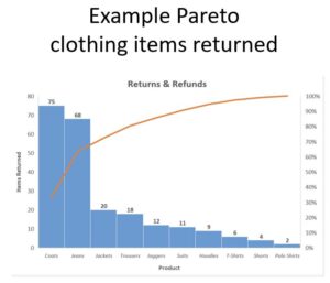
Why use this tool?
Using a Pareto chart helps a team concentrate its improvement efforts on the factors that have the greatest impact. It also helps a team communicate the rationale for focusing on certain areas.
For example you might want to look at
- Type of safety incidents that occur
- Causes of a specific type of problem
- Reasons for cancellation
They are a useful tool not only when identifying opportunities for improvement, but also in drilling down to understand the reasons for special causes on graphs showing counts, percentages and rates.
Source: https://learn.nes.nhs.scot/2348
A run chart is a line graph of data plotted over time. By collecting and charting data over time, you can find trends or patterns in the process.
What is it?
It is a line graph showing a measure in chronological order, with the measure on the vertical (y) axis and time or observation number on the horizontal (y) axis.
The median of the data points (the middle value) is added once 10 or so data points are available. Changes made to a process, and other useful annotations, are also often marked on the graph so that they can be connected with the impact on the process.
Sometimes, just by plotting your data over time, you can start to see patterns and understand more about what is going on in your system.
If you have at least 10-12 data points, there are four simple run chart rules you can use to help you assess whether there is any non-random variation present:
- A trend (5 or more points in the same direction),
- A shift (6 or more points on one side of the median),
- More, or fewer, runs than would be expected,
- An astronomical data point.
For your initial run chart looking at a measure, especially with historical or baseline data, you would calculate the median across all your data points. When doing improvement, it is often helpful to freeze and extend your baseline median, to help to detect a change sooner.
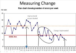
If you don’t have baseline data from before your project started, you can use your judgement as to whether it’s appropriate to create a baseline median from the first 10 or so data points – depending upon what you know about when change has happened.
Run charts can be created fairly simply in excel – using an Add-In such as QI charts – or by plotting a line chart that contains the data and the calculated median.
Rules on how to create a Run chart: https://www.lmpartnership.org/sites/default/files/nine-steps-create-storytelling-run-chart.pdf
Why use this tool?
Run charts are one of the most useful tools in quality improvement. They allow us to:
- Look at our data over time to assess performance and see whether there are any patterns
- Assess and show whether changes are resulting in improvement
- Monitor measures, to see whether improvement has been sustained
A histogram is a plot that lets you discover, and show, the underlying frequency distribution (shape) of a set of continuous data.
What is it?
A histogram is a chart showing the distribution of variables data. The variable is shown in order along the X axis, and the number of occurrences of each value (or group of values) is on the Y axis.
If your variables data is discrete with not too many values (for example a rating scale as in the picture above) you would have one column for each value. If the measure is continuous or has a lot of values, the scale would be divided into between 5 and 20 equal sized ‘bins’.
A histogram looks similar to a bar chart but it is not quite the same thing. A bar chart shows numbers with particular qualities or attributes, which have no particular order. The underlying data for a histogram has an order to it which is reflected in the chart.
How to create a histogram: http://www.ihi.org/resources/Pages/Tools/Histogram.aspx
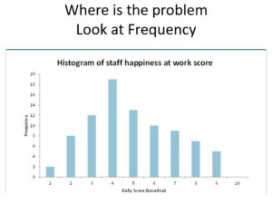
Why use this tool?
Use a histogram if you want to understand the distribution of data associated with:
- scales, for example satisfaction ratings or other measurements including age
- time
- money
- workload
This type of data is known as continuous (variables) data. The histogram will give you an idea of the location, shape and spread of the data.
It is useful to look at the distribution of data if you have collected a lot of data (at least 30 data items) to see whether there are any patterns occurring. For example, you might spot errors or anomalies in the data. Sometimes it is also useful to understand whether the data follows a typical ‘bell shape’ or if it is skewed or asymmetrical.
When investigating your data it can also be really useful to split it into different groups and compare histograms. For example, you might be interested to see whether different teams involved in the above project have similar distributions of happiness scores. This might help you to decide whether to focus in on specific teams or take some other approach.
Template resources
Download templates of QI tools and planning documents
Driver diagram template (78.7KB) Stakeholder map template (2.3MB) Cause and effect diagram template (39.8KB) PDSA template (64.5KB) PDSA cycle template (192.6KB) Communication plan template (52.5KB) Patient engagement plan - RCPCH&US (3.2MB pdf) RUN Chart - Developed by Richard Scoville, PhD. (651.0KB) Pareto chart template (31.5KB) Epilepsy12 - NHSE key priority measures (100.8KB pdf)